Description
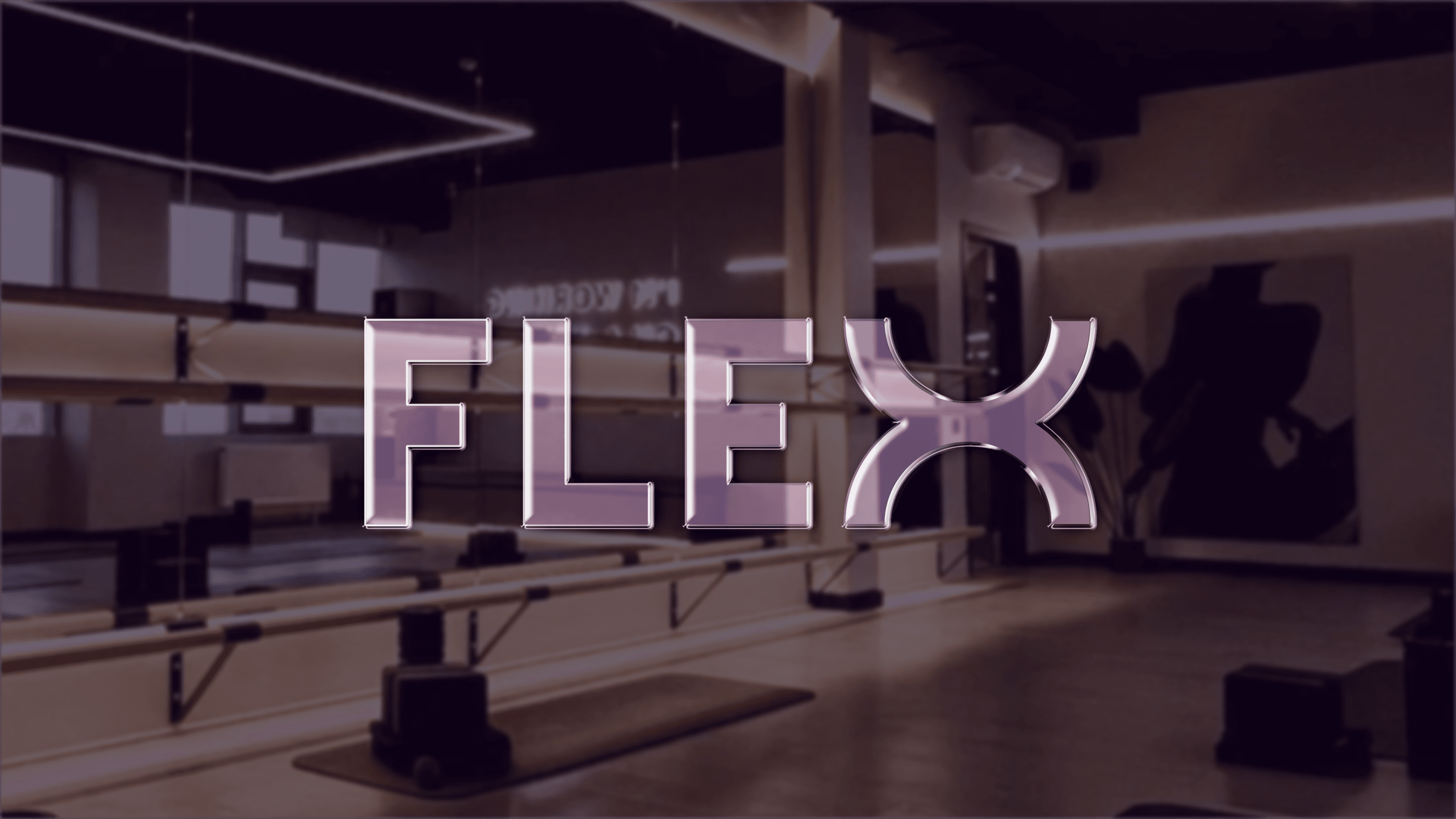
The primary goal was to develop a distinct brand identity for The FLEX, a Russian network of soft fitness studios, rooted in its mission of gentle, female-focused fitness, establishing a unique presence.
This involved crafting a logotype and symbol embodying the brand's ethos, a refined typography system, and a signature purple color palette. To ensure a strong social media presence, versatile graphic elements and templates were also created for impactful online communication.
Result
The project culminated in a cohesive and modern brand identity, featuring a distinctive logotype and symbol, a refined purple-accented color palette, and versatile graphic elements that effectively communicate the soft yet expert nature of The FLEX. A considered typographic system was also established to ensure clarity and enhance the brand's visual language, particularly across digital platforms.
Furthermore, adaptable social media templates were developed to ensure a consistent and engaging brand presence, fostering connection with the target audience.